

The Sondos Stone countertop color guide
How to Choose the Right Countertop Color
The best countertop color is not chosen from a sample wall. It is chosen beside your cabinets, flooring, backsplash and lighting—where every undertone becomes visible.
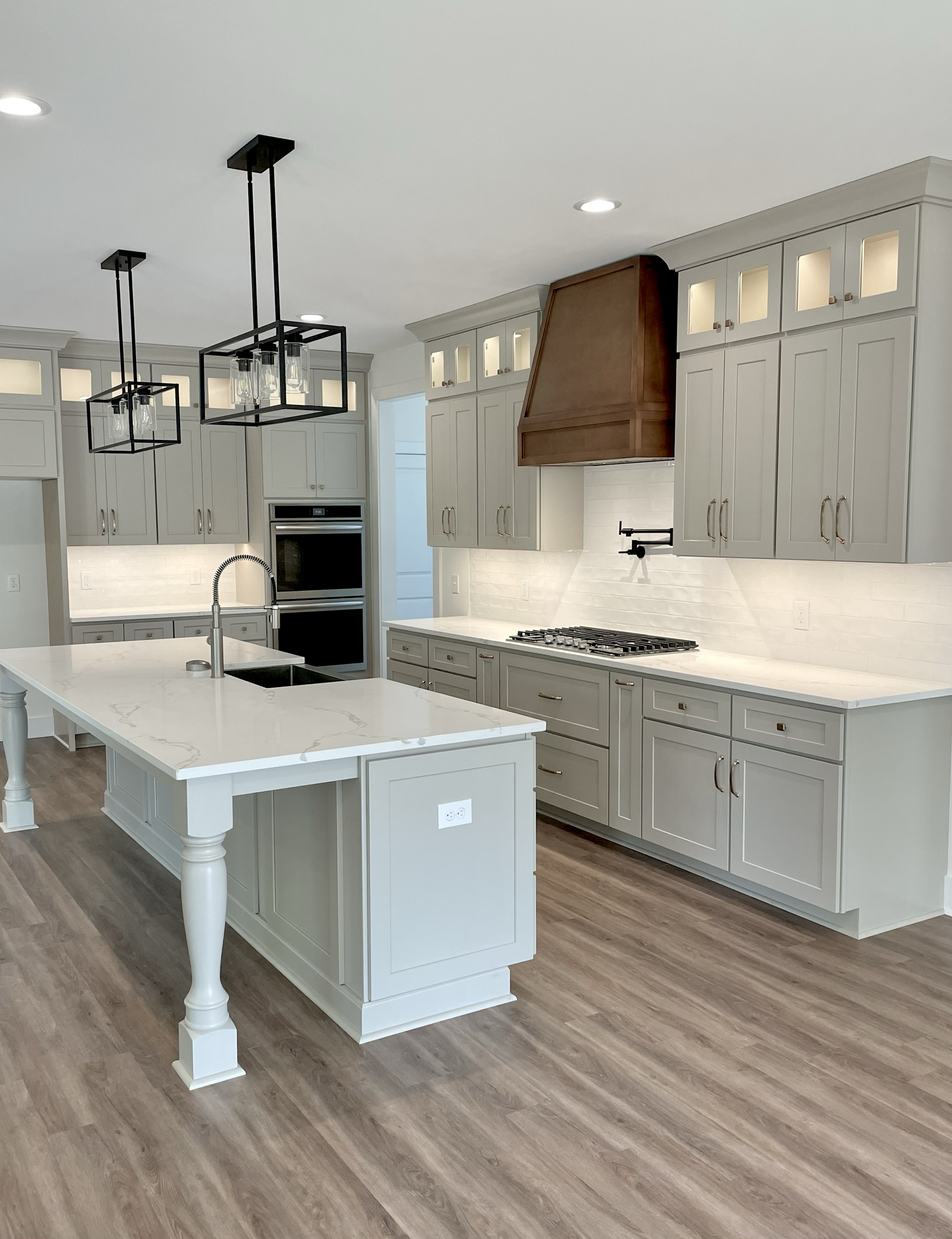
Start here
Choose the countertop after identifying what is already fixed.
Cabinets and flooring usually have the greatest influence because they occupy more visual space than hardware, faucets or decorative accessories.
First identify whether those finishes lean warm, cool or neutral. Then decide whether the countertop should blend quietly, create contrast or become the main focal point.
The final decision should be made using the actual cabinet door, flooring sample and countertop material inside the room—not from an online photograph.
The rule that prevents most mistakes
Do not force every finish to match.
A strong countertop may contrast with the cabinets, repeat one quiet tone from the flooring or connect several finishes through a warm neutral background.
It does not need to contain the cabinet color, floor color, hardware color and backsplash color all at once. Trying to match everything usually produces a surface that feels busy instead of coordinated.
Step 01 · Begin with the cabinets
What color are your cabinets?
Choose the closest cabinet category below. Each guide explains the countertop colors, materials, lighting and backsplash combinations that work best with that finish.
White Cabinets
Compare warm white, cool white, cream, wood tones and darker contrast without creating an accidental near-match.
Read the guide →Black Cabinets
Use light stone for balance or dark texture and movement for a more architectural kitchen.
Read the guide →Oak Cabinets
Balance yellow, orange, red or beige wood undertones without repeating too much brown.
Read the guide →Gray Cabinets
Identify whether the gray leans blue, green, violet, beige or charcoal before choosing stone.
Read the guide →Blue Cabinets
Compare navy, slate, teal and pale blue with warm-white, cream and cool-neutral countertops.
Read the guide →Green Cabinets
Sage, olive, eucalyptus and forest green require different countertop temperatures.
Read the guide →Step 02 · Read the undertone
The hidden color matters more than the label.
Two materials may both be described as white, gray or beige and still clash once they are placed together. The underlying yellow, red, green, blue or violet influence creates the difference.
The countertop sample test
Stand the cabinet door upright. Lay the countertop sample flat.
Light strikes vertical and horizontal surfaces differently. Laying every sample flat on a showroom table can hide undertone conflicts that become obvious after installation.
Compare your finishes with us →Yellow or golden
Common in honey oak, cream paint, beige tile, warm maple and some warm-white cabinet finishes.
Start with:Warm white, cream, ivory, beige, greige and controlled gold or taupe movement.
Red or pink
Common in red oak, cherry, mahogany, reddish flooring and some beige or taupe paint colors.
Start with:Balanced cream, muted greige and neutrals that do not exaggerate the red.
Green or olive
Common in sage cabinetry, olive paint, green-gray finishes and some natural stones.
Start with:Warm white, cream, taupe and quiet movement without excessive violet or blue influence.
Blue or violet
Common in cool-gray cabinets, navy paint, blue-white finishes and some gray flooring.
Start with:Crisp white, pale gray, charcoal or a clearly warmer contrast chosen intentionally.
Decide the relationship
Should the countertop blend, balance or lead?
Blend
Similar values create a quiet, continuous kitchen. The countertop should still differ enough through tone, texture or movement to avoid looking like an imperfect match.
- White oak with pale greige
- Warm-white cabinets with cream quartz
- Light gray with subtle white movement
Balance
The countertop is clearly separate from the cabinetry without becoming the main visual feature. This is the easiest direction for many transitional and organic-modern kitchens.
- Oak with warm-white stone
- Navy with cream quartzite
- Green with ivory quartz
Lead
The countertop becomes the focal point through dramatic movement, strong contrast, a waterfall edge or full-height stone backsplash.
- Black cabinets with bright stone
- White cabinets with charcoal
- Quiet cabinets with expressive quartzite
Step 03 · Respect the flooring
The floor is too large to ignore.
Flooring can introduce more yellow, orange, red, gray or beige than the cabinets. It may cover more visible space than the countertop, so it must be included in the final comparison.
Warm but visually quiet
Warm white, cream, pale quartzite, greige and charcoal can all work. Decide whether the countertop should continue the softness or create contrast.
Strong golden warmth
Cream, ivory or balanced greige can calm the orange influence. Avoid adding another heavily yellow or brown surface without separation.
Deep visual weight
Light countertops usually maintain balance. A subtle brown or taupe detail can connect the countertop to the flooring.
Often cooler than expected
Compare white, warm white and greige carefully. Some gray flooring turns blue or violet beside beige and yellow stone.
Warm fixed foundation
Cream, ivory, beige-gray and stone with quiet taupe movement usually transition more naturally than a sharp cool white.
Already a focal surface
Keep the countertop quieter. A nearly solid or lightly veined surface prevents the room from collecting too many competing patterns.
Find one shared undertone or create deliberate contrast. A countertop that almost matches wood or tile can look less intentional than a clearly different surface.
Step 04 · Read the room
A countertop color is never seen under one kind of light.
Natural daylight, recessed fixtures, pendants and under-cabinet lighting can each pull a different undertone from the same surface. A white countertop may look clean in the morning, warmer in the afternoon and noticeably gray after sunset.
Take the sample into the actual kitchen. Place it beside the cabinet door and flooring, then check it near a window, beneath the upper cabinets and under the room’s permanent lights.
Compare finishes in the kitchen visualizer →Cooler, softer daylight
Warm white, cream and pale greige can keep the room from feeling flat or blue. Crisp white and silver-gray surfaces may appear cooler than expected.
Stronger, warmer daylight
These rooms can support cooler whites and grays more easily. Cream, beige and gold movement may become more pronounced during the brightest hours.
Artificial lighting controls the palette
Lighter countertops usually preserve more visibility. Dark stone can still work when task lighting and under-cabinet lighting are planned intentionally.
More yellow and beige influence
Warm bulbs strengthen oak, cream, taupe and gold. They can also make certain bright whites appear duller or more yellow.
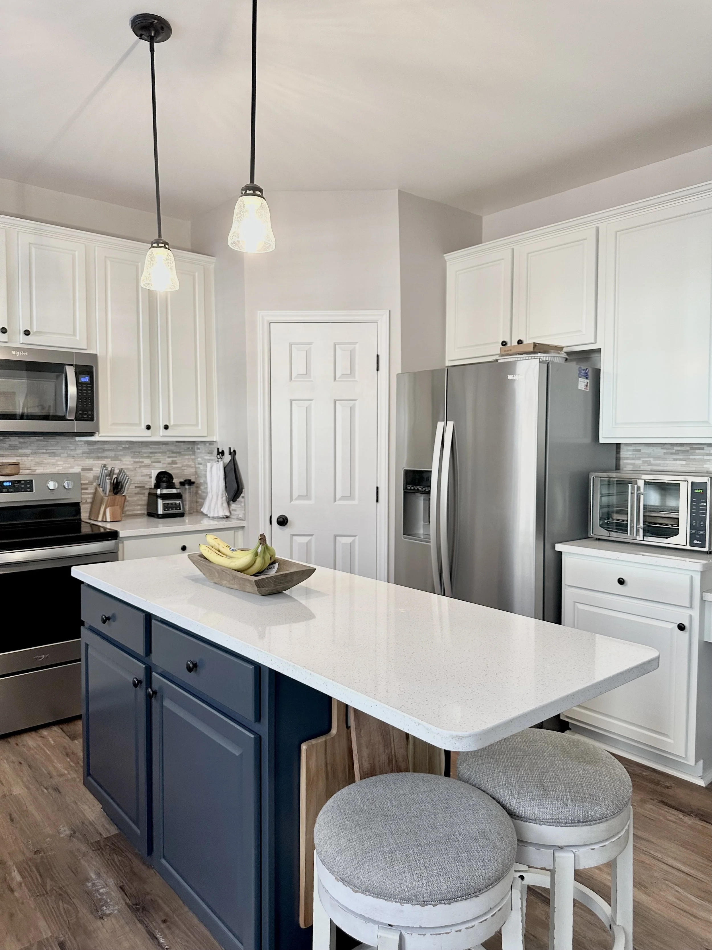
Contrast with a purpose
The countertop should make the cabinet color easier to understand.
In this palette, the light countertop connects the white perimeter cabinets to the navy island. The surface is not trying to match either cabinet finish exactly. It creates a clean bridge between them.
This is often stronger than choosing one countertop for the perimeter and another for the island. Repeating the same surface can keep a two-tone kitchen from feeling divided.
Step 05 · Choose the relationship
Blend, balance or lead.
Before comparing individual slabs, decide what job the countertop should perform. This one decision eliminates many colors that may be attractive but wrong for the room.
Blend
A quiet, continuous palette
Choose a countertop close to the cabinetry in brightness and temperature when you want the room to feel calm. The two surfaces should still differ through subtle movement, texture or depth.
White oak + pale greige · Warm white + soft cream · Light gray + quiet white
Balance
Clear separation without a harsh divide
This is the most flexible direction. The countertop is noticeably lighter, darker or warmer than the cabinetry, but it does not dominate the entire kitchen.
Oak + warm white · Navy + cream quartzite · Sage + ivory quartz
Lead
Let the stone become the focal point
Dramatic quartzite, strong veining, a waterfall end or a full-height backsplash can lead the design. Keep the cabinetry, floor and tile controlled so the stone has room to work.
Quiet cabinets + expressive slab · Black cabinets + bright stone
Two whites, grays or beiges that are close—but carry different undertones—often look less intentional than a clearly contrasting combination.
Step 06 · Narrow the color family
Start broad. Choose the exact surface second.
Do not begin by comparing dozens of product names. First decide whether the room needs warm white, cream, greige, taupe, gray or dark contrast. Then compare materials within that family.
Warm white
The safest bright option for oak, green, navy, cream and warm-gray cabinets. It keeps the kitchen light without the sharpness of a blue-white surface.
Explore quartz →Cream and ivory
Strong with natural wood, olive green, traditional cabinetry, beige floors and brass. Cream creates softer contrast than bright white.
Explore quartzite →Greige
Useful when the room contains both warm and cool finishes. Always check whether the greige shifts violet, green or pink beside the cabinets.
Gray cabinet guide →Taupe and beige
Creates layered warmth without forcing a bright contrast. Taupe is especially effective with black, oak, olive and cream cabinetry.
Compare all colors →Gray
Works in contemporary kitchens with white, blue, black and cool wood cabinetry. Avoid stacking several nearly identical gray surfaces.
Explore Dekton →Charcoal and black
Creates architectural contrast with pale cabinetry. Dark surfaces need good lighting and enough separation from dark floors or cabinets.
Explore granite →Step 07 · Select the material
The right color still has to work in your kitchen.
Once the color direction is clear, compare how each material behaves. Quartz offers more pattern consistency. Granite and quartzite provide natural variation. Marble requires comfort with etching and patina. Dekton supports more architectural designs.
Color should narrow the options—not override maintenance, slab variation, heat precautions, edge limitations or fabrication planning.
Quartz
Best when consistency matters
Quartz is often the easiest material to coordinate with an exact cabinet color because the overall background and movement are more predictable. It generally does not require routine sealing, but direct excessive heat should be avoided.
Browse QuartzGranite
Best for natural mineral character
Granite can hide minor everyday debris and bring depth to a quiet kitchen. Review the actual slab because mineral colors, pattern and porosity vary between materials and bundles.
Browse GraniteQuartzite
Best for expressive natural movement
Quartzite can become the main design feature through broad natural veining and layered color. Review the complete slab and plan how movement will pass through corners, seams, islands and backsplashes.
Browse QuartziteMarble
Best for classic natural character
Marble can create a soft, established appearance, but acidic products may etch the surface. Sealing can reduce absorption; it does not prevent acid-related etching.
Browse MarbleDekton
Best for minimal architectural palettes
Dekton works well in modern white, concrete, gray and charcoal color directions. Confirm the product thickness, finish, edge treatment and fabrication requirements for the exact project.
Browse DektonMaterial note
Sealing does not make natural stone stain-proof.
The Natural Stone Institute explains that impregnating sealers improve stain resistance rather than creating an absolute barrier. The exact stone, finish and use should determine whether sealing is needed and when it should be renewed.
Natural Stone Institute care guidance →Before you make the final choice
Eight countertop color mistakes worth avoiding
Most disappointing combinations are not caused by choosing a bad material. They happen when the material is judged alone instead of as part of the complete kitchen.
Choosing from an online photograph
Phone screens, filters and professional editing change white balance, brightness and undertones. Use online images for direction, then verify the color with a physical sample or slab.
Matching the cabinets too closely
Two nearly identical whites, grays or beiges can look accidental when their undertones differ. A clearer contrast is often safer than an imperfect match.
Ignoring the flooring
Flooring may introduce stronger yellow, orange, red, blue or gray undertones than the cabinets. Always include it in the comparison.
Making every surface dramatic
Bold stone, patterned tile, strong cabinet color and busy flooring compete for attention. Decide which surface should lead and let the others support it.
Testing only under showroom lights
Showrooms are usually brighter than residential kitchens. Check the material in the actual room during daylight and again after sunset.
Selecting natural stone from a small sample
A sample cannot show the complete movement, mineral variation or focal areas of a granite, quartzite or marble slab.
Chasing a short-lived trend
Trend-driven colors can work, but the countertop is expensive to replace. Use cabinet paint, hardware and decor for easier future changes.
Choosing color before understanding maintenance
The perfect color may still be the wrong material for your cooking, cleaning habits and expectations. Compare appearance and daily use together.
The final countertop color checklist
Do not approve the material until all seven answers are yes.
This checklist is simple, but it catches most expensive color and layout mistakes before fabrication begins.
- 01 Does the countertop work with the cabinet undertone?
- 02 Does it work with the flooring?
- 03 Have you viewed it during daylight and at night?
- 04 Is the contrast level intentional?
- 05 Does the pattern compete with the backsplash?
- 06 Have you reviewed the complete natural slab?
- 07 Does the material fit your maintenance expectations?
Countertop selection in the NC Triad
Bring the cabinet door, flooring and paint sample.
Comparing your actual finishes beside countertop samples is the safest way to avoid conflicting whites, grays, creams and wood undertones.
Sondos Stone helps homeowners, builders, remodelers and cabinet companies compare quartz, granite, quartzite, marble and Dekton before templating and fabrication.
We serve Greensboro, Winston-Salem, High Point, Jamestown, Kernersville, Burlington, Lexington, Thomasville, Asheboro, Archdale, Trinity and surrounding North Carolina Triad communities.
Compare the room finishes
Cabinets, flooring, paint, backsplash and hardware.
Narrow the color family
Warm white, cream, greige, taupe, gray or dark contrast.
Compare available materials
Review appearance, care, variation, thickness and budget.
Confirm the slab and layout
Plan seams, focal movement, backsplash pieces and overhangs.
Continue planning
Countertop colors, materials and design guides
Browse by cabinet color
Countertop color FAQs
Questions homeowners ask before choosing
What is the safest countertop color?
Warm white, cream and pale greige are among the most flexible countertop colors because they work with many cabinet and flooring finishes. The exact undertone still needs to be compared with the room.
Should countertops be lighter or darker than cabinets?
Either can work. Dark cabinets usually benefit from lighter countertops, while light cabinets can support either a quiet pale surface or deliberate dark contrast.
Should countertops match the flooring?
They do not need to match exactly. A stronger approach is to share one undertone or create deliberate contrast. Near matches can look accidental.
How do I know whether a countertop is warm or cool?
Warm surfaces tend to contain cream, beige, yellow, brown, taupe or gold. Cool surfaces tend to contain blue, silver, cool gray or violet. Compare the sample beside a true white sheet of paper to make the undertone easier to see.
What countertop color makes a kitchen look bigger?
Light warm-white, cream and pale greige countertops can reflect more available light and create a calmer, more open appearance, particularly with a restrained backsplash.
Can dark countertops work in a small kitchen?
Yes. Dark countertops can work when cabinets, walls and flooring remain lighter and the kitchen has sufficient natural and task lighting.
Should the countertop and backsplash match?
They can match, but they do not have to. Continuing the countertop material vertically creates continuity. Quiet tile can add texture without competing with the stone.
Is quartz easier to color match than natural stone?
Usually. Quartz patterns and backgrounds are generally more consistent, while natural slabs vary. Natural variation can be an advantage when you want a one-of-a-kind focal surface.
Should I see the whole natural-stone slab?
Yes. A small sample cannot show the complete color range, movement, mineral variation or features of a granite, quartzite or marble slab.
What countertop colors have the broadest resale appeal?
Warm whites, creams, quiet greiges and restrained natural movement generally appeal to a broad range of buyers because they coordinate with many cabinet and flooring colors.
Does natural stone need to be sealed?
Many granite, quartzite and marble surfaces benefit from an impregnating sealer. The need and schedule depend on the exact stone, finish, sealer and use.
Does Sondos Stone serve Greensboro and Winston-Salem?
Yes. Sondos Stone fabricates and installs countertops across Greensboro, Winston-Salem, High Point, Jamestown and surrounding North Carolina Triad communities.
Material and care references
External countertop resources
These sources support the general natural-stone and engineered-surface care guidance in this article. Always follow the instructions provided for the exact material installed in your kitchen.